Dashboards: Transactions column widget
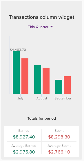
The Transactions column widget shows the total sum of transactions over a selected date range as a column chart, similar to the Transactions histogram 📊
In this article
The Transactions column as a banner widget

The transaction column widget can be configured as a banner or a column widget. Both will display the total amount earned and spent, as well as the average for each column across the period.
The banner widget is best suited for more extended periods of time, or when you want to see a more granular breakdown (e.g., daily transaction grouping across a month, or weekly transaction grouping across a quarter).
The Transactions column as a column widget
The Transactions column widget is more compact than the banner version and better suited for viewing shorter periods of time.

How the average amounts are calculated in the Transactions Column widget
The average earned and average spent values shown in the Transactions column widget are calculated by dividing the total by the number of columns displayed on the graph.

For example, the above widget shows $8,927.40 earned over a quarter, divided into three monthly columns, which gives an average earned of $2,975.80 per month.
The example below shows earning and spending over a month, broken down into weekly groupings. The graph is broken into five columns to reflect five weeks (including partial weeks). As such, the average earned is calculated by taking the total earned $3,180.80 divided by 5, which gives an average of $636.16:

Configuring the Transactions column widget
Easily customise the widget to show you the exact information you are after:

You can even create multiple widgets, each configured to include different accounts or categories!
Income and expense transactions determined by category type
If this option is enabled, transactions within the widget will be organised into income or expense based on the type of category that they belong to, instead of the positive or negative amount of the transaction itself.
For example, if you received a refund in your Groceries category, and the category was set up as an expense category, the refunded amount would be deducted from the total spend for the relevant period rather than reported as income. For more on category types see: Category types in PocketSmith
View options
Savings and deficit:
When selected, each column in the graph reflects the total amount of income less any expenses, giving you a net savings or deficit for each period, ie. the 'Difference':

When this is not selected, the graph will show an income and an expense column for each period. The 'Difference' will still show when hovering over the relevant period:

Transaction grouping:
The transaction grouping option refers to the period of time each column reflects. Choose between Daily, weekly, monthly, quarterly, or yearly. You can also use Auto to let PocketSmith make the choice for you.

If you select Auto grouping, PocketSmith will choose the grouping for you. This is based on the selected date range and the most suitable grouping to ensure a balanced number of columns is displayed. This typically ranges from 6 to 8 columns, depending on whether you are using the column or banner widget.