Dashboards: Balance graph widget
The Balance graph widget shows your total account balances over time, enabling you to see your overall forecast balance and compare your past actual balances with your historic forecast balances 📈
In this article
The Balance graph widget
The Balance graph widget displays your cumulative account balances over time, allowing you to view your overall forecast balance and compare your past forecast and actual balances at a glance.

Configuring the Balance graph widget
You can configure the Balance graph widget to include all accounts, selected account types, or specific accounts only. Choose to display past forecast balances or view a handy table breaking down individual account balances - the choice is yours!
Check out the configuration options below for the Balance graph widget

Configuration options for the Accounts list widget:
-
Custom widget title (optional)
Enter a custom title to display this on the top left of the widget. If no title is entered, no title will appear.
-
Select balance types to show
Choose whether you'd like the graph to display your Actual balance, Forecast balance, and Historical forecast balance. You can view all three, just the actual balances or a combination thereof.
-
View options
Zoomable - displays an interactive slider to zoom in on your graph:
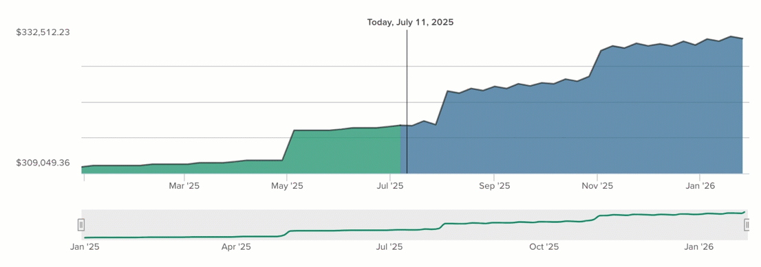
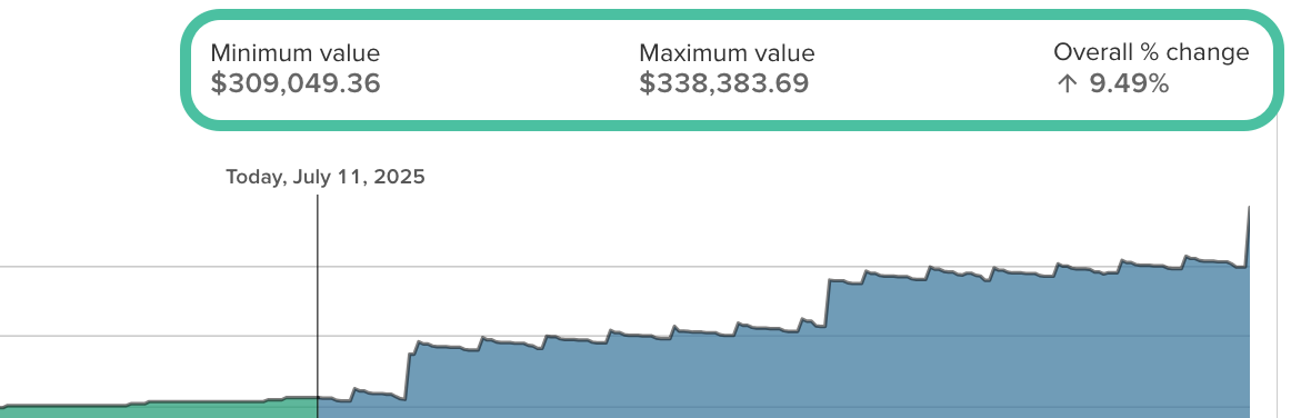
Statistics - includes minimum value, maximum value and the percentage of change over the date range displayed:
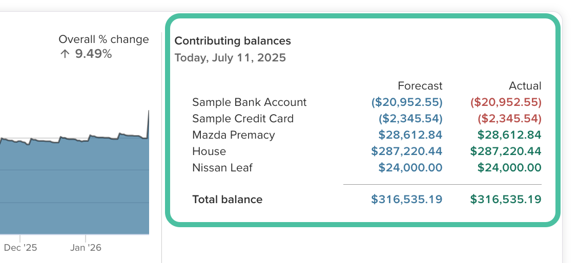
Balances table - displays a list of the balances reflected on the graph on the current date. If you click on the graph at any point, the table will show the balances for that specific date:
-
Show assets and/or liabilities
Choose whether the graph will display both assets and liabilities, only assets, or only liabilities. In this case, assets include any bank accounts with a positive balance, as well as assets added via the Net Worth page. Liabilities include any bank accounts with a negative balance and debts added via the Net Worth page.
-
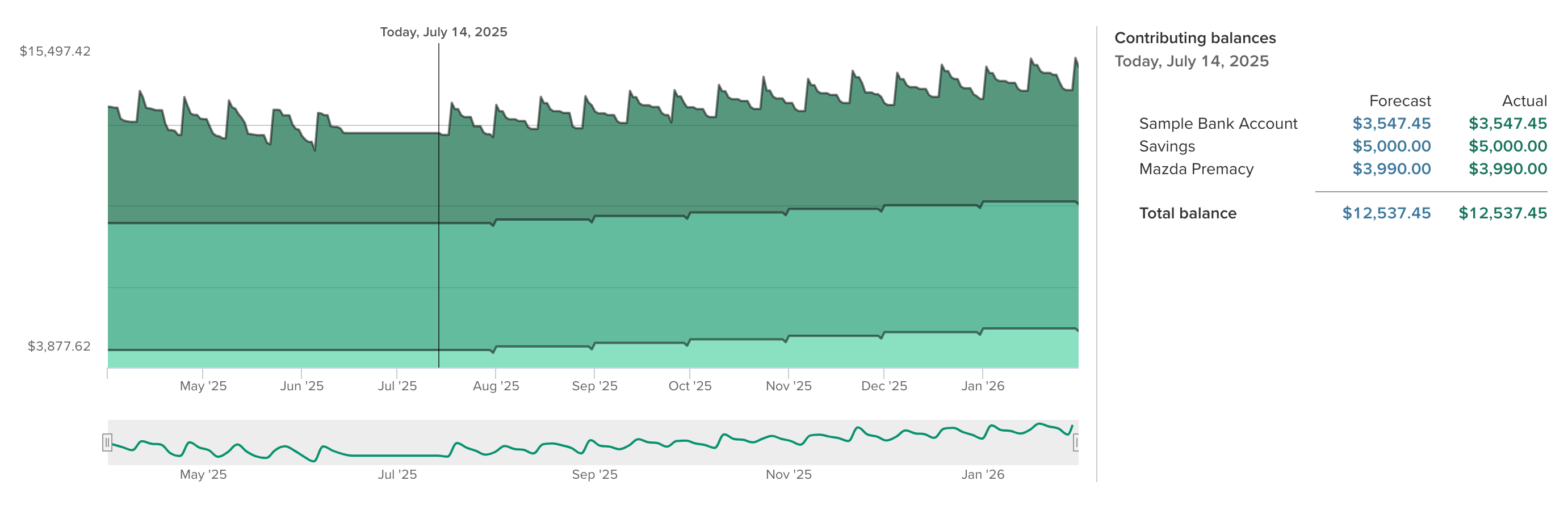
Show graph as a stack
When viewing only assets or only liabilities, you can choose to have the graph stack account types together, or individual accounts together to see how each contributes to the overall balance total.
For example the below image shows individual accounts stacked, with assets only selected:
-
What date range do you want to show?
Set the date range by entering the amount of months past and months future you'd like to show. E.g. 6 months past, and 12 months into the future.


-
Account select
Choose to show all accounts, selected account types, or selected accounts
For selected accounts, drag and drop the accounts you'd like to display over to the Selected accounts column
Tips for the Balance graph widget
Excluding certain accounts
Use the Account select section of the widget settings to select the accounts you'd like to include in the Balance graph widget.
Hiding historical forecast balances
If you aren't interested in viewing your historical forecast balances here, you can opt not to include them from the Select balance types to show section of the settings.
Viewing account balances
For a breakdown of your account balances in the past, or forecasted balances in the future, opt to include the Balances table from the View options section.
Balance graph widget shows big difference between past forecast and actual balances
If your past forecast has diverged significantly from your actuals, you may wish to troubleshoot why this is happening, or reset the past forecast to match your actual balances via the Calendar.
Use the Balance graph widget to see which account(s) are contributing to the issue by enabling the Balances table and comparing the past and actual forecast figures. You can then troubleshoot individual accounts further as per: Forecast graph shows a big difference between forecast and actual balances