Budget burndown chart
The budget burndown chart lets you check that you're on track with your budgets, helping you spot whether you are on target or have drifted into overspending.
In this user guide
Budget burndown chart overview
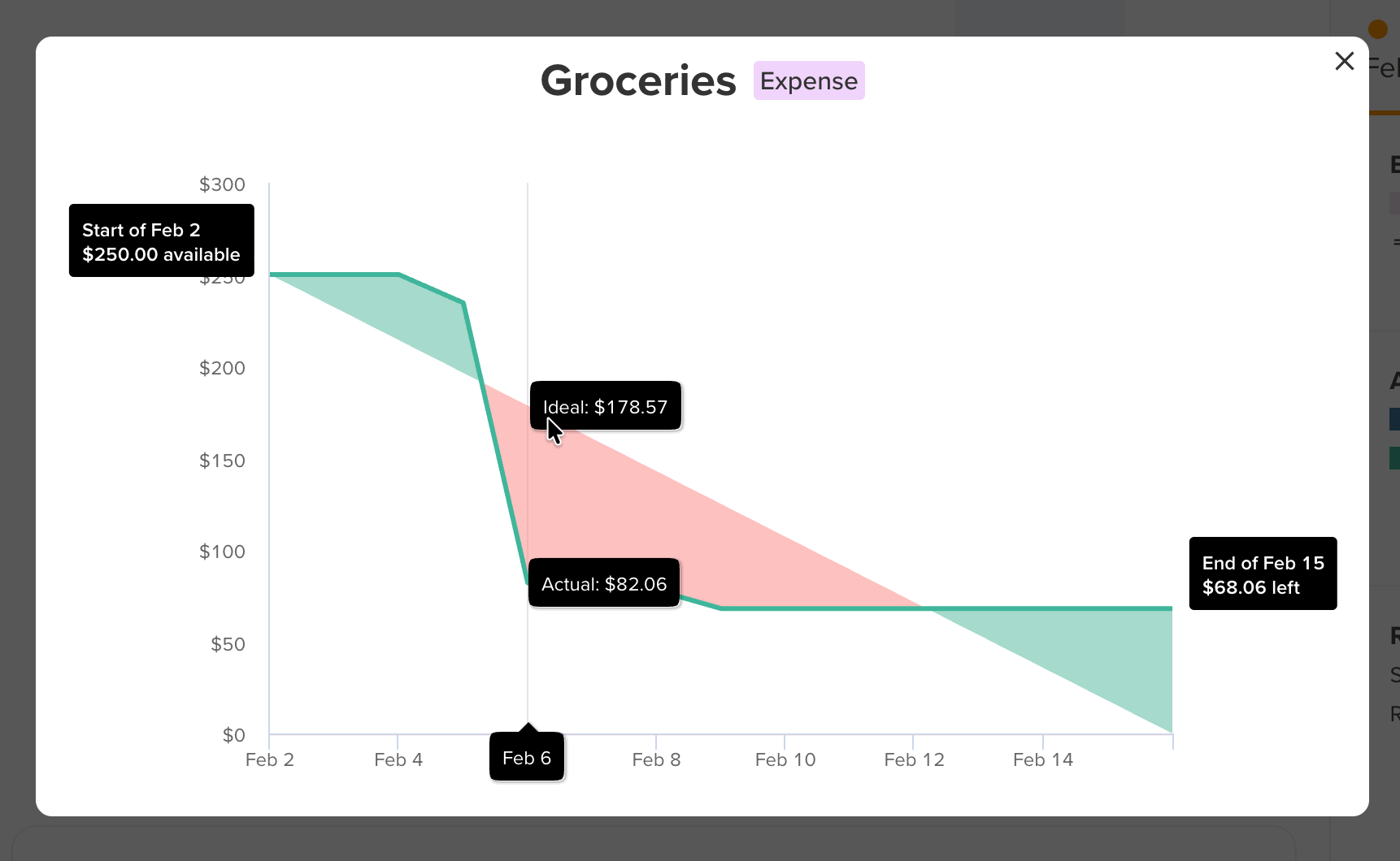
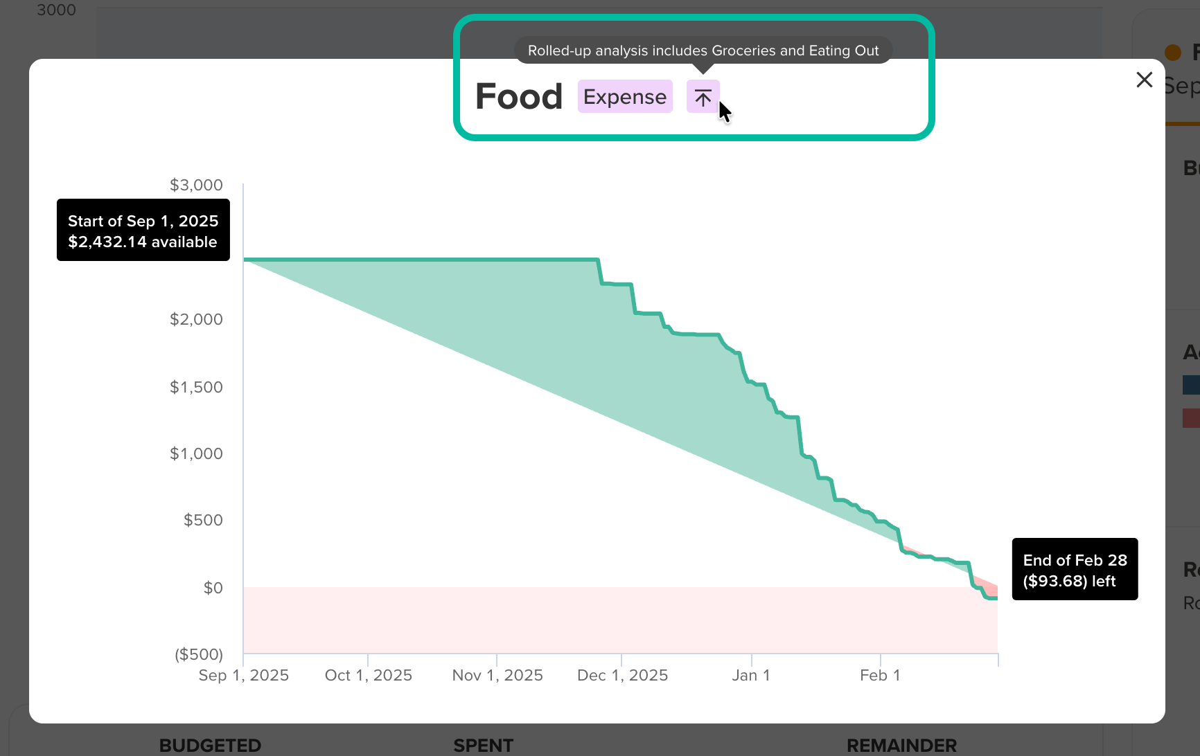
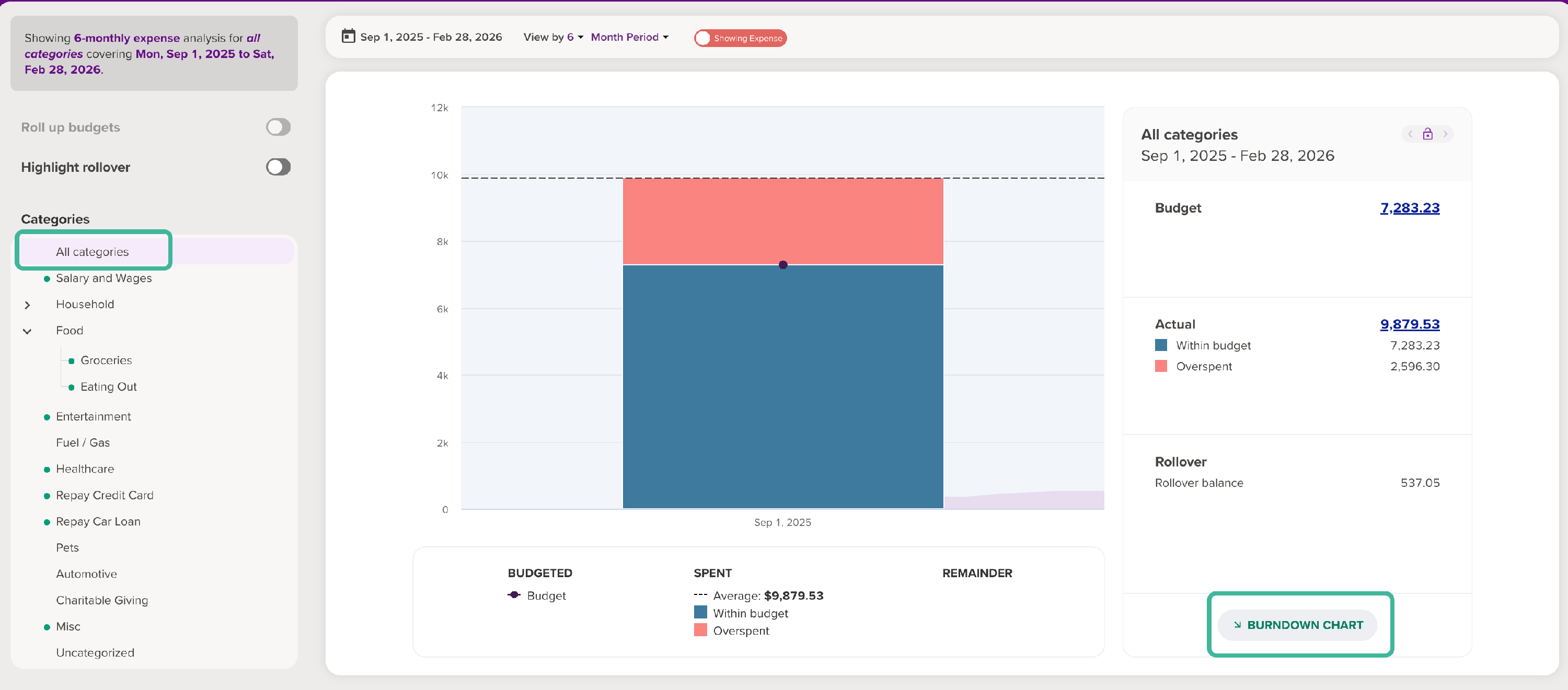
The budget burndown chart shows the total amount you have budgeted over a given period across one or more categories. It then plots your spending in those categories against a straight line, starting from the total budgeted at the start of the period and ending at $0 at the end of the period.
Using this chart, you can track how closely you’re sticking to your budget over any budget analysis period. When you hover over a point, the graph shows the ideal spend amount and compares it to the actual spend. Green shading (above the budget line) shows you're on track to spend less than your budget, while red shading (below the line) indicates overspending. In doing so, the chart highlights any points that you're drifting below the ideal trend line for inconsistent spending. This lets you quickly pinpoint the time you began slipping into overspending.
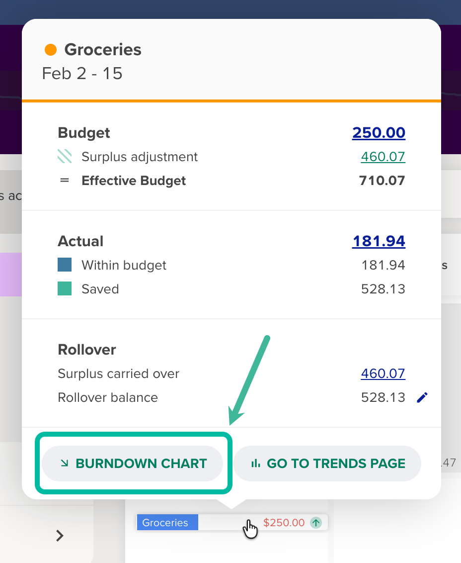
Accessing the budget burndown chart
The budget burndown chart can be accessed from the Budget analysis panel found throughout the app. This includes the Calendar, Budget page, Trends report, Income & Expense report, and Budget widget on the Dashboard.
For more on the Budget analysis panel, and where to find it, see: Budget analysis panel
Where to view the burndown chart over a single budget period vs multiple budget periods
Whether you can view the chart across a single budget period or over multiple budget periods will depend on where you access it.
If accessing the burndown chart via:
- Budget widget - the current budget period for the selected category will be shown.
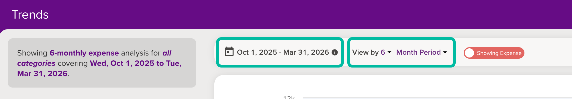
- Trends report - the burndown chart will reflect the date range selected at the top of the Trends report, and the period selected on the Trends bar graph.
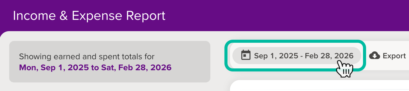
- Income & Expense report - the burndown chart will reflect budgeted vs actual spending across the date range applied to the report.
- Budget page - If no date range is applied, the current budget period will be shown. If a date range has been applied, the burndown chart will reflect budgeted vs actual spending across this date range.
- The Calendar - The chart will show a single budget period, beginning on the budget event date selected on the calendar.
Viewing the burndown chart over multiple budget periods
You can view the burndown chart over any given time period on the Budget page, the Trends report and the Income & Expense report.
Budget page: If ‘Use total budget summary date range’ has been applied to the Budget page, the burndown chart will reflect budgeted vs actual spending for this date range. If no date range is applied, only the current budget period for the selected category will be shown.
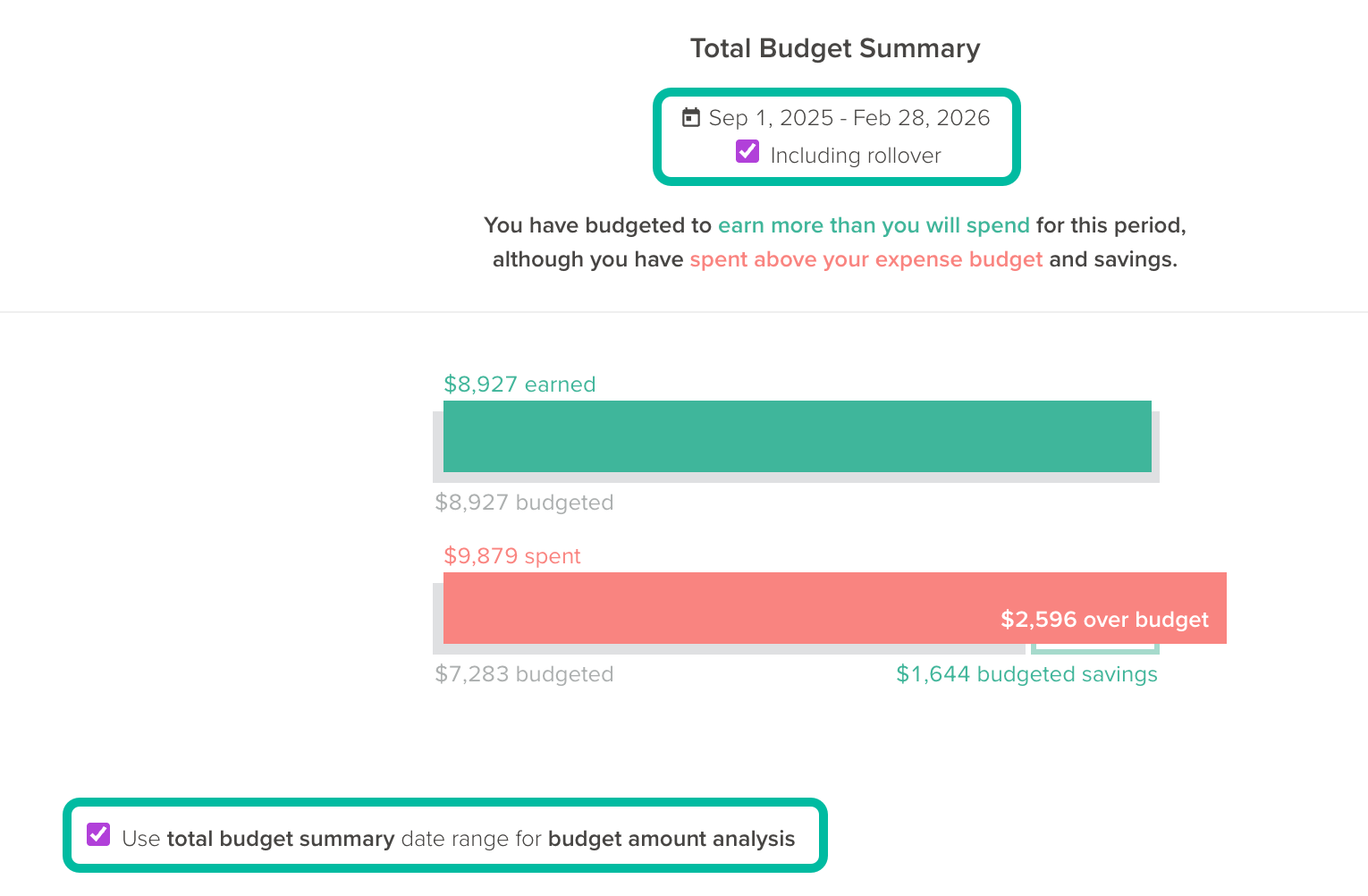
Income & Expense report: The burndown chart will reflect budgeted vs actual spending across the date range applied to the report.
Trends report: The burndown chart will reflect the date range and associated period selected at the top of the Trends report.
Viewing parent categories, with roll-up enabled, on the budget burndown chart
You’re able to view the burndown chart at the parent category level from the Budget page, the Income & Expense report, and the Trends report.
Trends report
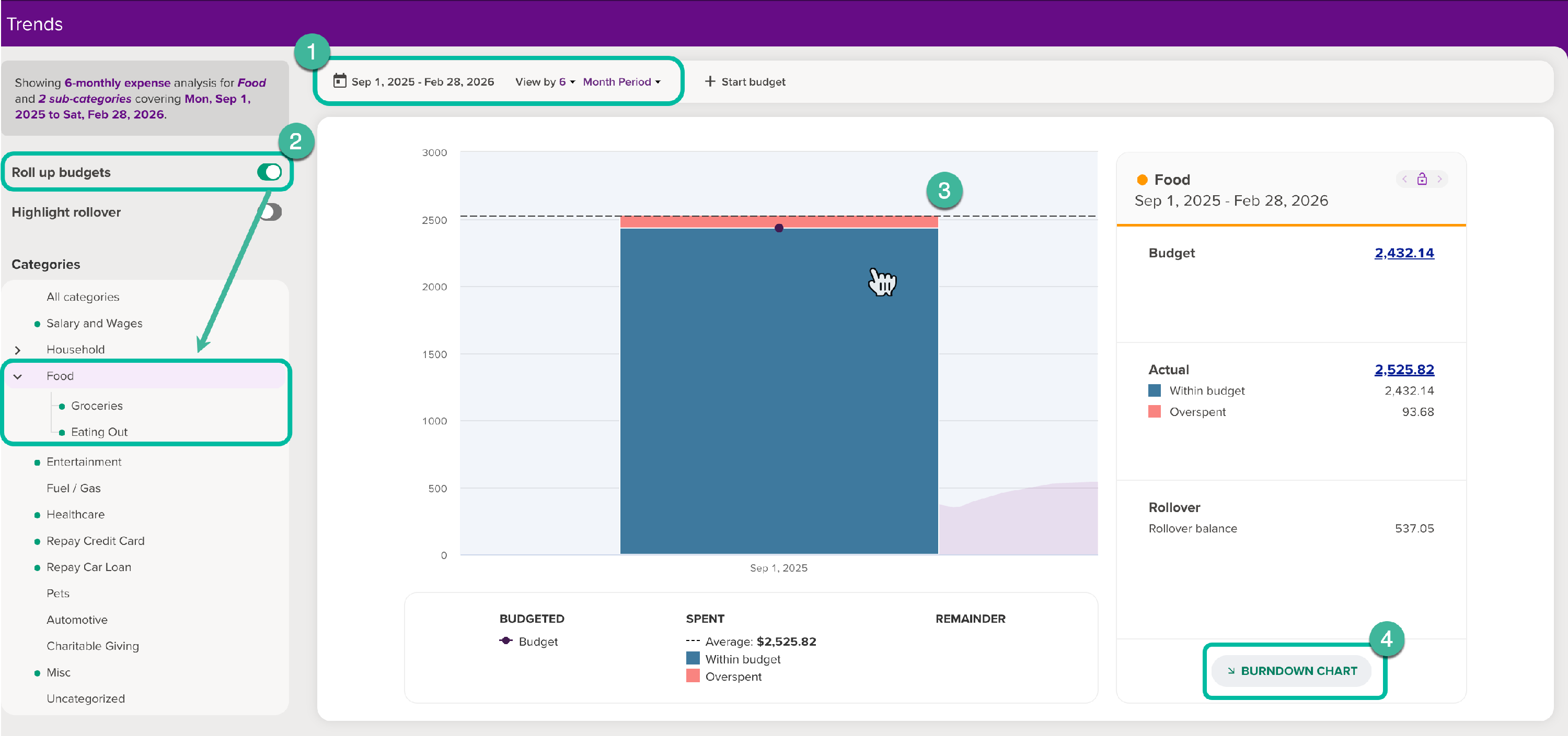
To view the burndown chart at the parent category level on the Trends report:
- Choose the date range and period you’d like to analyse
- Enable the ‘Roll up budgets’ option from the sidebar and select the parent category you’d like to view
- If applicable, select the specific period you’d like to view from the bars within the Trends bar graph.
- Click ‘Burndown chart’
Budget page
To view the burndown chart at the parent category level on the Budget page:
- Ensure the budget is rolled up by clicking the roll-up arrow at the right of the row
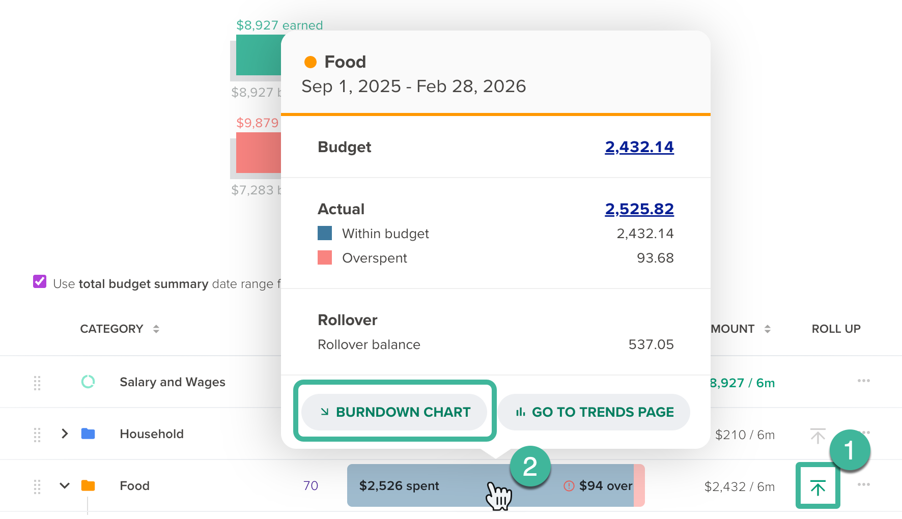
- Hover over the parent category budget, and select Burndown chart from the Budget analysis panel
Income & Expense report
To view the burndown chart at the parent category level on the Income & Expense report:
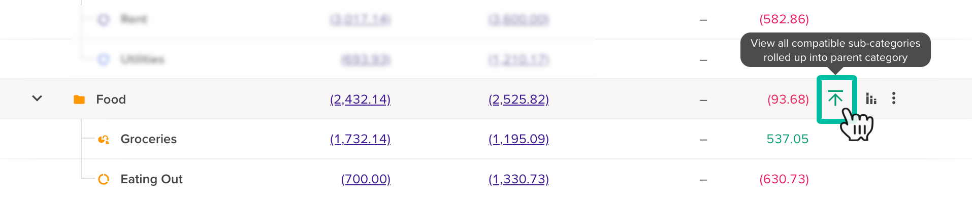
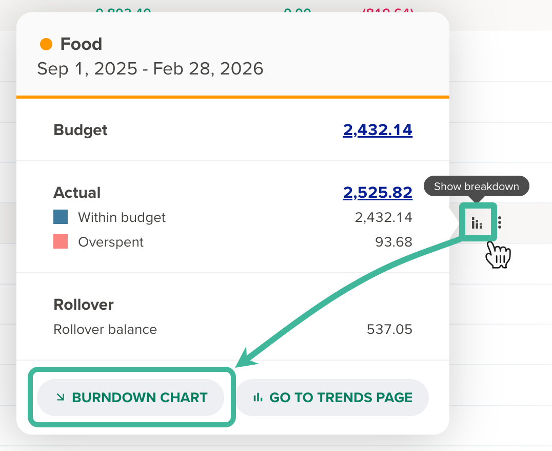
- Ensure the roll-up option is enabled on the parent category you’d like to analyse
- Click the Show breakdown’ icon that appears on hover at the end of the row, then choose Burndown chart.
Viewing all categories on the budget burndown chart
You’re able to view ‘all categories’ on the budget burndown chart via the Budget page and the Trends page.
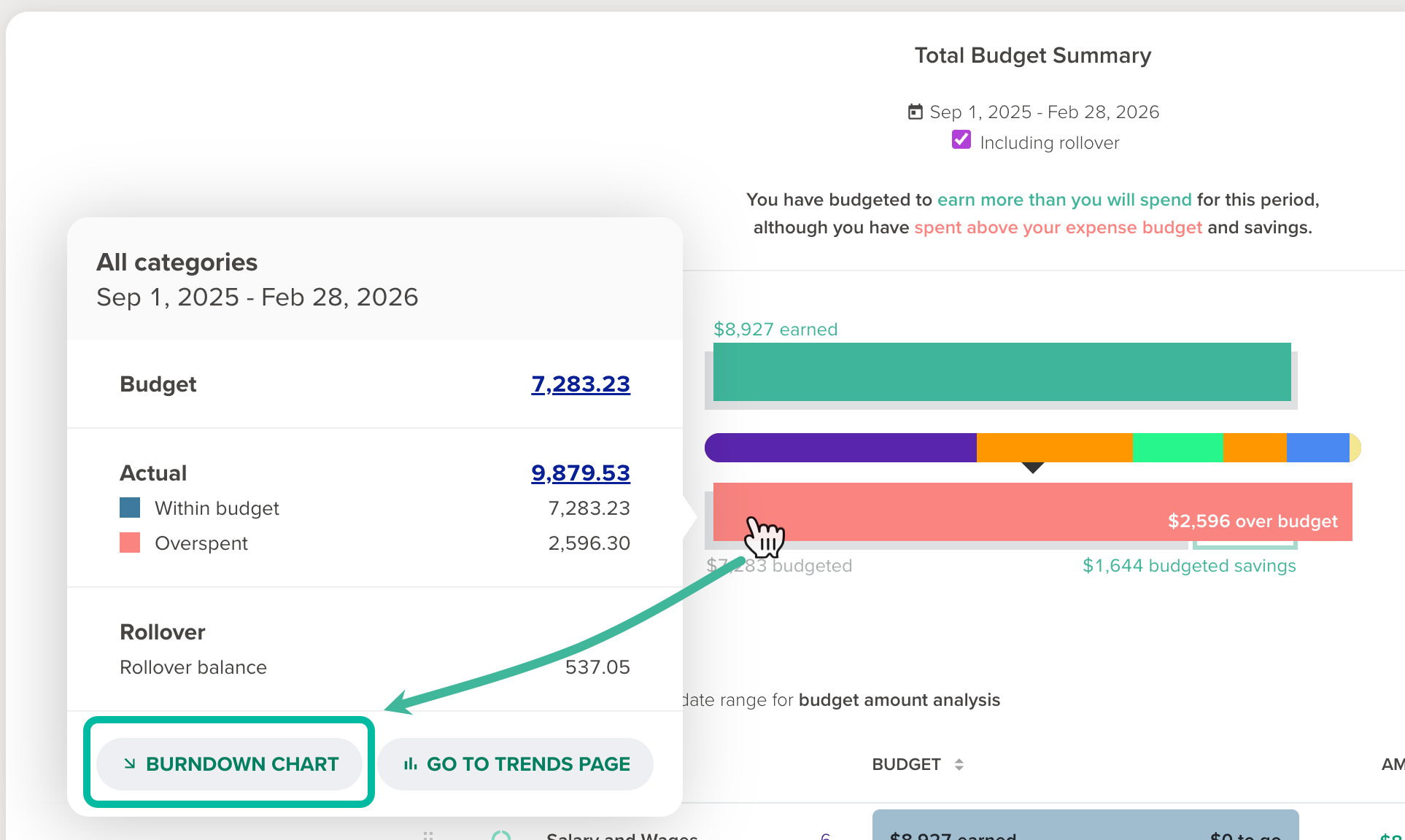
Budget page
Hover over the total expense budget bar to view all budgeted expense categories on the burndown chart. Similarly, you can view the burndown chart for all budgeted income categories via the income budget bar.
Trends page
Once you’ve chosen your date range and period, select ‘All categories’ from the sidebar, then click ‘Burndown chart’ in the budget analysis panel.
Rollover budgets and the budget burndown chart
If rollover is turned on, when viewing individual periods, the burndown chart will only analyse the original budgeted amount, and won't include any surplus or deficit. This means the burndown chart is consistent whether rollover is enabled for a category or not.
Rollover is a beta feature. For more on rollover budgeting, see: Rollover budgeting