Dashboards: Category sankey widget
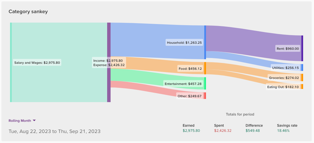
The Category sankey widget offers a visual representation of how your money flows, showing where your money comes from and how it is then allocated into your categories and sub-categories 🙌
This widget is only available as a banner widget due to its width.
In this article
What is a sankey diagram?
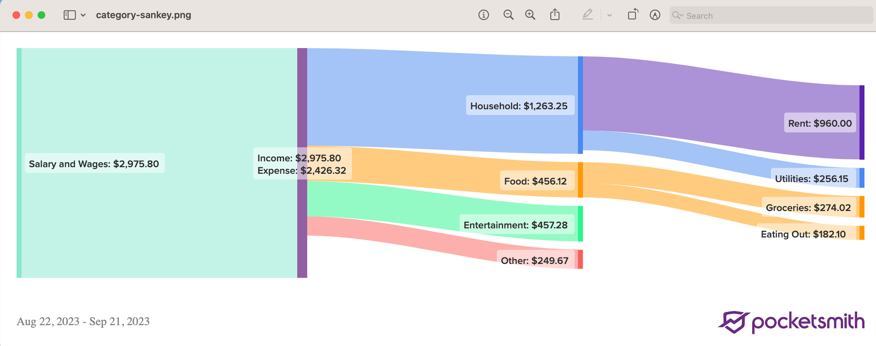
A sankey diagram is a directional graph that is brilliant for providing a comprehensive view of your cash flow. It allows you to see how your income is allocated across various expense categories, savings, and investments.
The graph illustrates your income sources on the left, and then flows on to show how this income is subsequently divided into categories and sub-categories. Best of all, it's proportional! The width of each flow line matches the amount of cash flow, so you can see exactly how your hard-earned cash is being divvied up 🌈 🙌
For example, you can view the proportion of income going toward essentials like rent and groceries, as well as discretionary spending like entertainment. This clear visual representation can help identify areas of your budget that might need tweaking to allow you to reach your goals 💸
To learn more about sankey diagrams and how they are helping our users, check out this post over on our blog: Using PocketSmith’s Sankey Diagram to Visualize My Money Flows
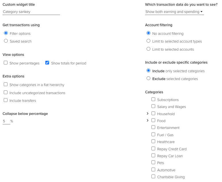
Configuring the Category sankey widget
Configure the Category sankey widget to show key information you are interested in. You can limit account types, exclude certain categories, and choose different view options - the choice is yours!
Exporting the Category sankey widget
You can export the chart as an image for sharing 🙏
Just hover over the widget's top right, and click the export icon:
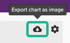
The chart will be exported in a PNG format: