Transactions page graphs and charts
The Transactions page has three graphs and charts you can use to analyze your transactions and balances - a balances line graph, transactions pie chart, and transactions histogram 📉🥧📊
The selected graph will reflect the current transaction listing, including any search criteria or filters that have been applied.
Read on to learn more about each graph and the insights they can provide.
In this user guide
Overview of the Transactions page graphs and charts
Choose from a line graph, pie chart, or transactions histogram view to analyze your transactions. 
- Balances line graph
The line graph shows the balances of your accounts over a period of time, based on the accounts in the current search criteria.
Note:
The date range of the Transactions page line graph cannot be extended into the future. To see your forecast balances, head to the Calendar page.
- Transactions pie chart
The pie chart shows a breakdown of the categories based on the current search criteria.
- Transactions histogram
The transactions histogram shows the total amount of income and/or expense transactions per day/week/month/year based on the current search results.

Change the data reflected in the pie graph or histogram
The selected graph will reflect the current transaction listing, including any option from the sidebar, or, any transactions search criteria that has been applied.
For example, if you are viewing 'all transactions', all transactions will be included in the graph, if you have applied a filter or search criteria, then only the filtered transactions will be included.
Click on the magnifying glass to open the search panel and filter your transactions by specific criteria, or, use the sidebar to filter your transactions by account, category, or saved search.

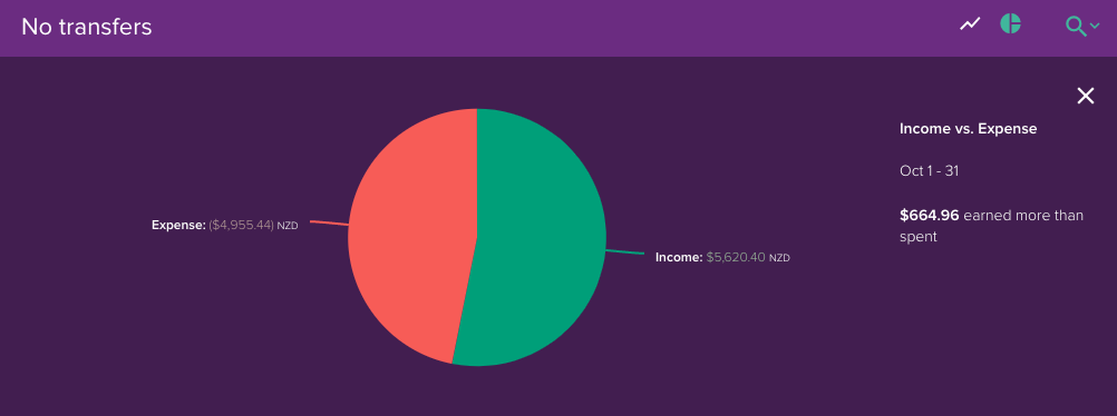
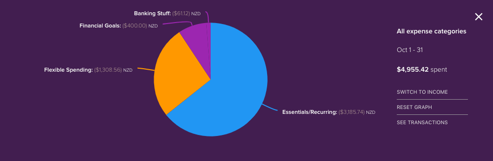
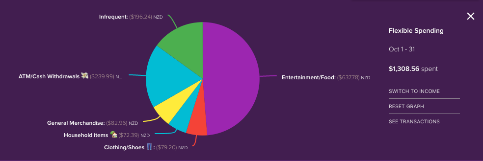
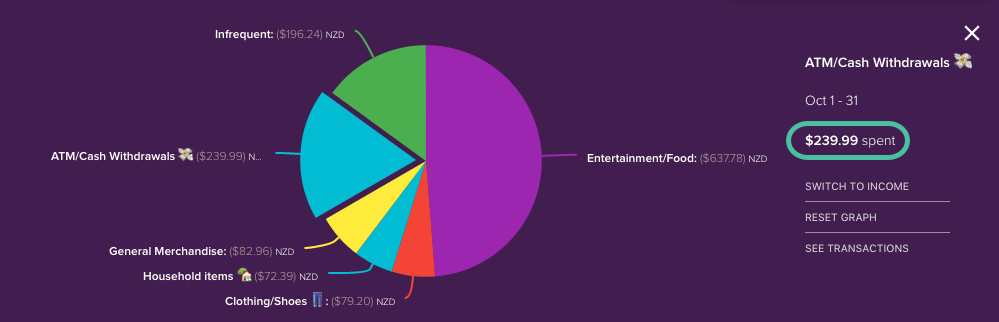
Transactions pie chart
The transactions pie chart shows you your income vs expense based on the current search criteria. You can then drill down into your income or expense categories to see the contributing categories.
Here is an example of the pie chart based on All transactions:


Tip
In order to exclude transfers from the pie chart, you can change the 'Transaction type' search criteria to only show 'Non-transfer' transactions. For more detail on how to do this see Removing transfers from the transactions pie chart
Additional options for the Transactions pie chart
To the right of the pie chart, you'll see a couple of options allowing you to easily:
- Change the date range
- Switch to income or expense (depending on what you're currently viewing)
- Reset the graph

Note
The transactions pie chart allows you to easily drill-down into sub-categories. However, it's not possible to go back a step to the category above once drilled down. You will need to reset the graph and drill back down again.
Transactions histogram
The transactions histogram allows you to see your total income and expense broken down into daily, weekly, monthly, or yearly periods for the current search criteria.

- Hover over the bar to view the income and expense totals for that period

- Average expense and income amounts (per period for the date range displayed) are reflected via a line on the graph, with the average amount displayed below the graph.

- Adjust the date range displayed using the date picker

- Choose from daily, weekly, monthly, or yearly periods in the selector beside the graph


Balances line graph
The line graph on the transactions page allows you to see an overview of the balance history for your accounts for the period selected.

- Hover over the line graph to see the amount on a specific date.

- When the transactions page first loads it will display the combined balance of all accounts by default. To view the balance graph for a single account, select the desired account in the sidebar.
- If you have search criteria applied, then the combined balances for any accounts included in the search results will be displayed.
- You can adjust the date range displayed using the date picker, and the date slider below the graph.
Note:
The date range of the Transactions page' line graph cannot be extended into the future. To see your forecast balances, head to the Calendar page.
